Optix Product Illustrations / 2017 - present
~ art direction, graphic design, illustrations, branding, animation
~ art direction, graphic design, illustrations, branding, animation
During my time working at Optix, I’ve had the opportunity to design a wide variety of illustrations and animations for the platform.
I’ve created many of the current illustrations that exist in the product, built out a visual style with design components to match; while, maintaining true to Optix’s simple and clean brand language.
Below are a few of the illustrations and animations I’ve created for the web and mobile products.
I’ve created many of the current illustrations that exist in the product, built out a visual style with design components to match; while, maintaining true to Optix’s simple and clean brand language.
Below are a few of the illustrations and animations I’ve created for the web and mobile products.
Mobile Onboarding
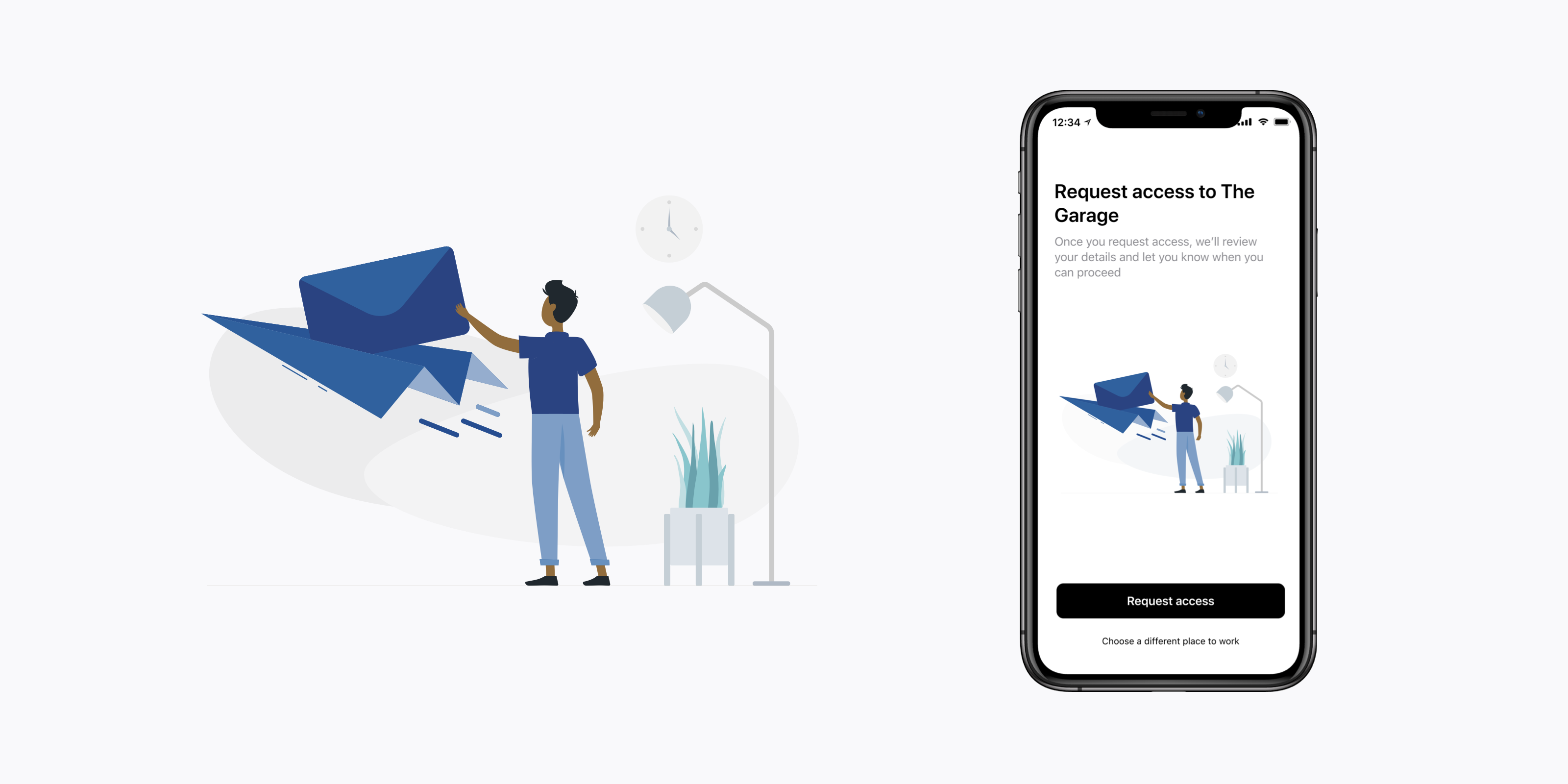
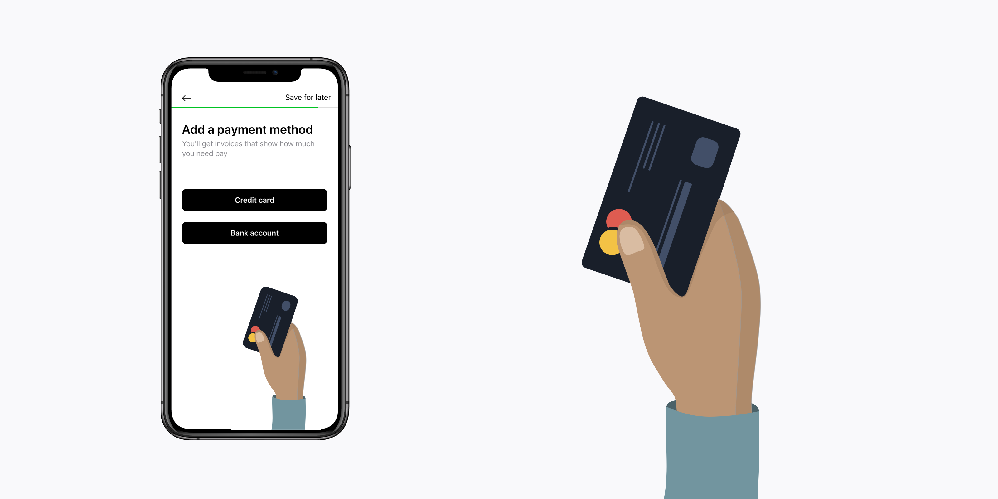
Alongside our product designer, I worked on a new onboarding flow for users into the mobile app. This included a variety of illustrations to communicate the steps. Below is a collection of illustrations from this onboarding flow.


Web Empty States
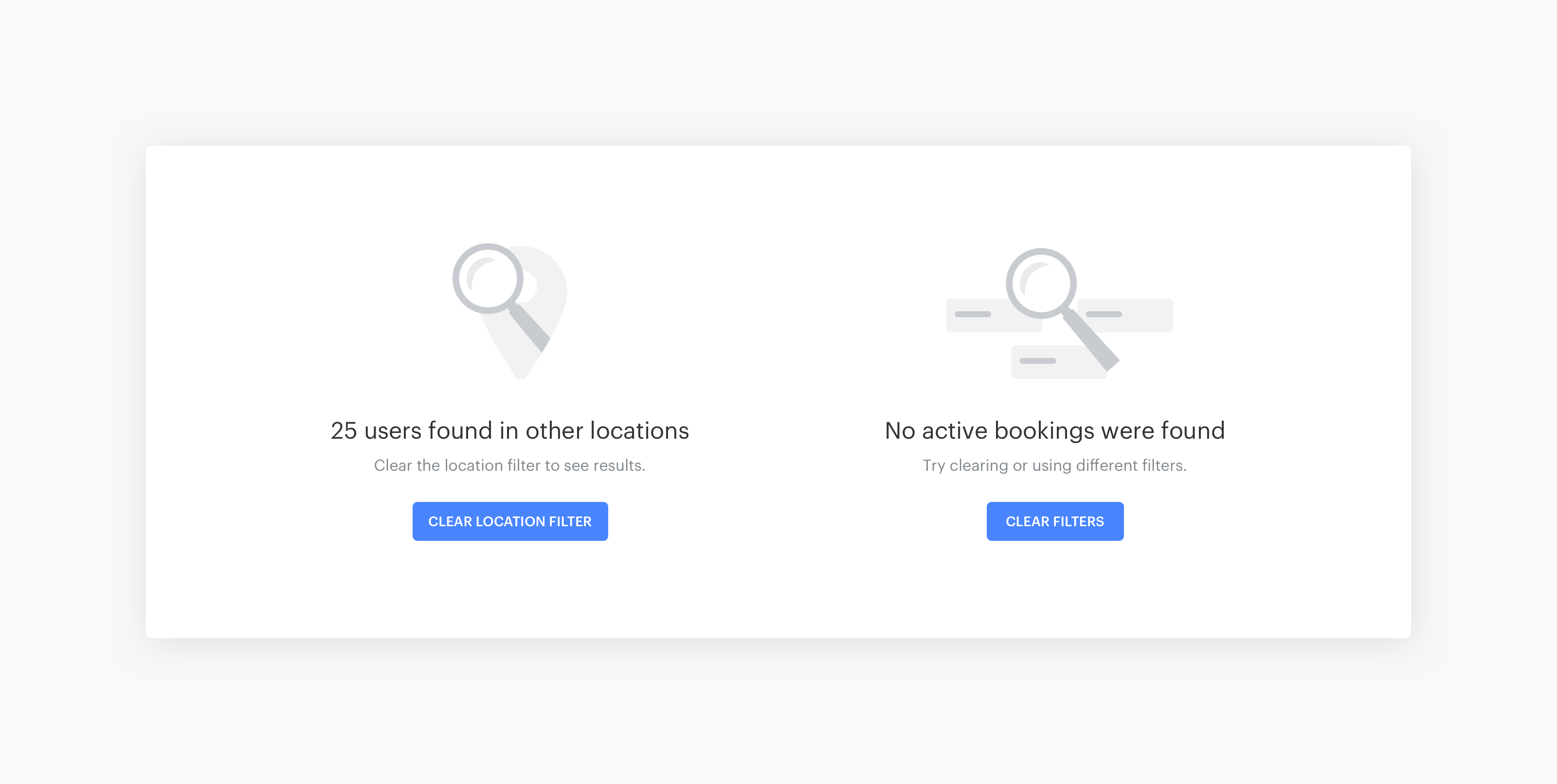
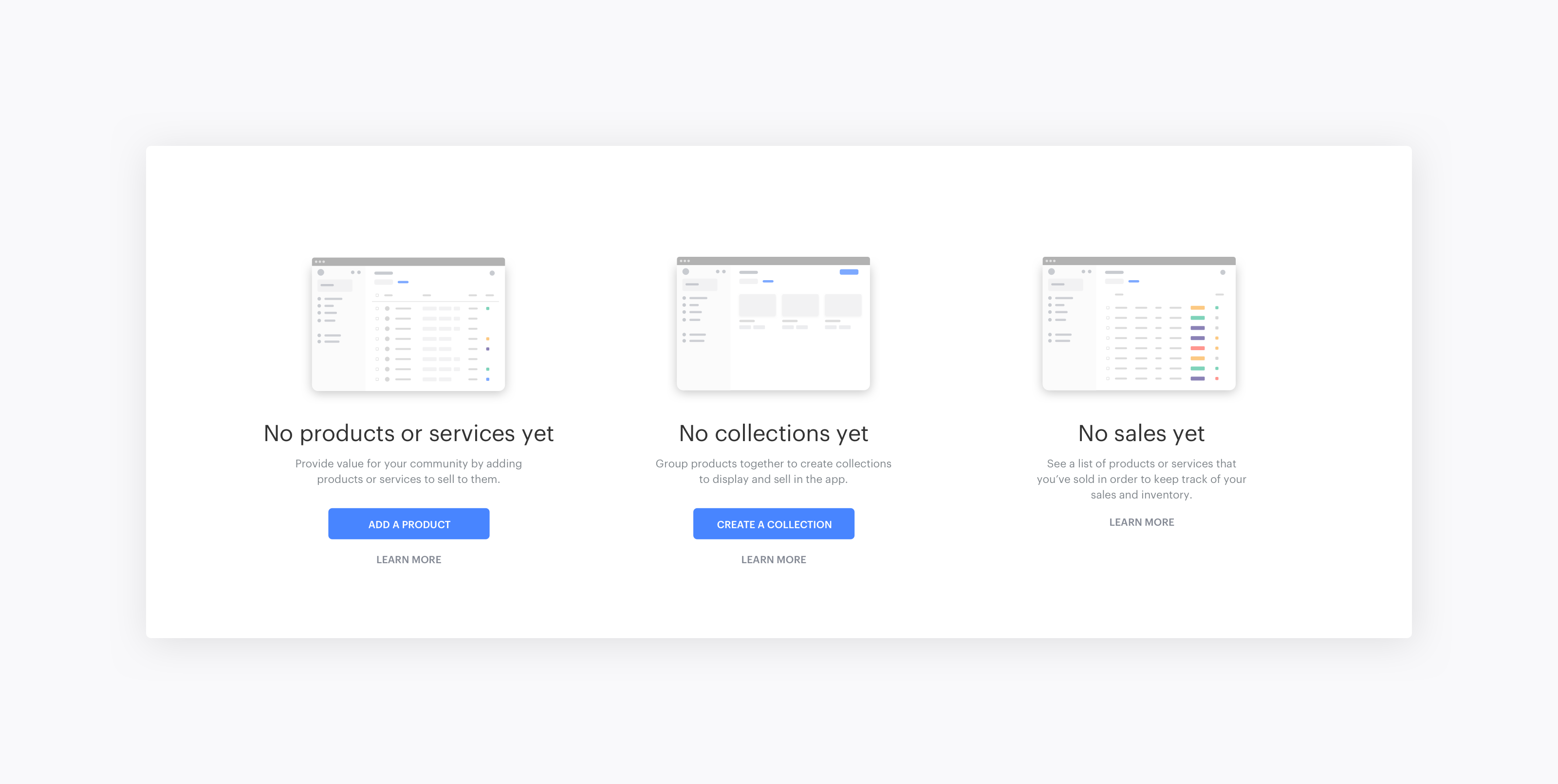
I’ve designed, and continue to design, the empty state graphics used throughout the Optix web platform. Each instance is designed to communicate the specifics of the context for the user, while also following a consistent visual style. Below are a few examples of my work.


Mobile Welcome Screens & Empty States
Small illustrations throughout a mobile experience make a big difference. They often delight users, and help convey a message. I designed these with a careful balance of communicating the context to the user, while still maintaining the positive and welcoming voice of Optix.


