Optix Marketing Site

Optix Marketing Site / 2018
~ branding, ux design, ui design
~ branding, ux design, ui design
As part of my work as a digital designer at Optix, I lead the redesign of the Optix marketing website. My worked included researching the competitive landscape, refining the Optix brand, building out a structure through sitemaps and wireframes, and creating visual assets for the site. This project strengthened my ability to create meaningful work from a user-focused design process.
︎ View the site
︎ View the site
Identity
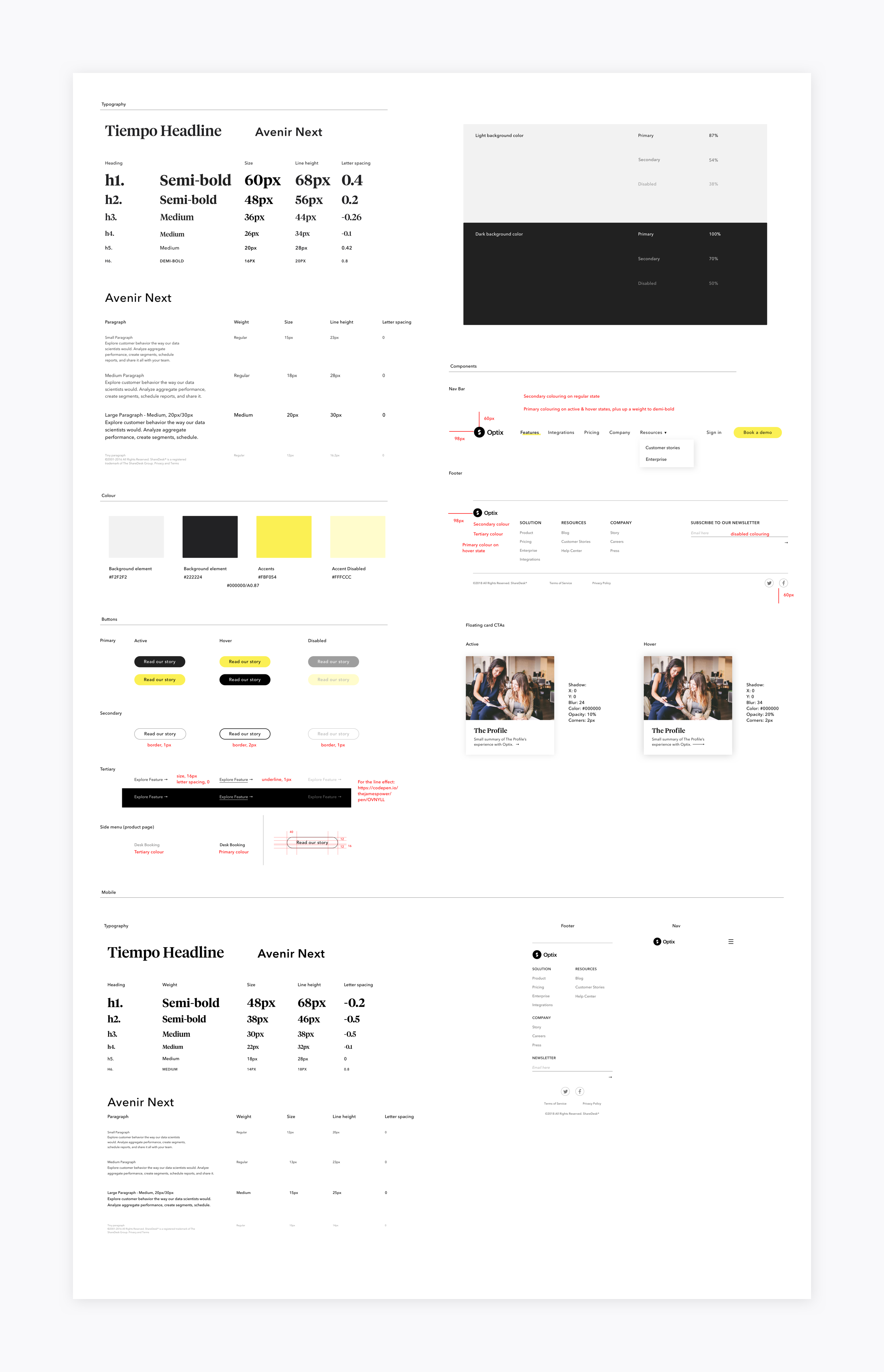
Updated style guide for Optix that complements the original wordmark and reflects the growing brand’s values and platform. This included a new typeface, colours, imagery, and cta styling to introduce a more modern and distinctive brand.
Site map
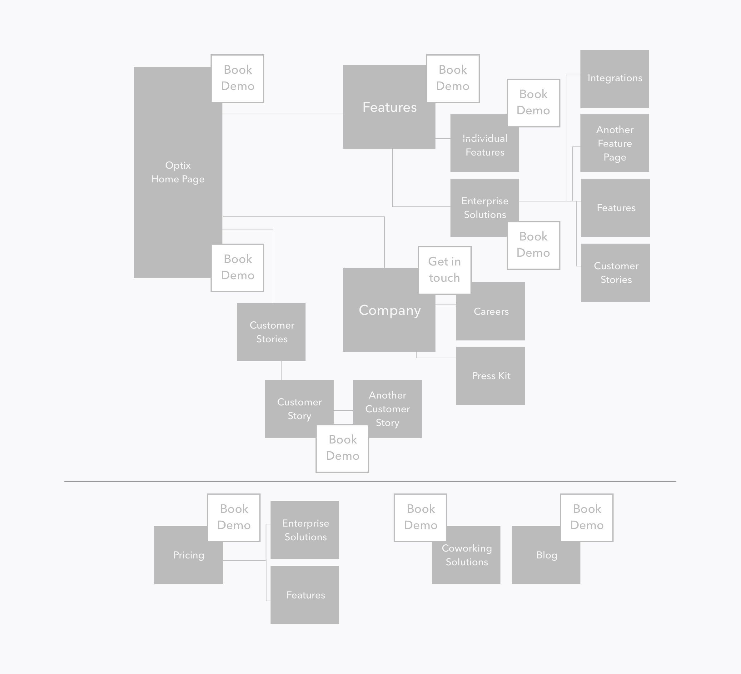
Worked with stakeholders of the busines to understand the needs of the company. We worked together to create a site map from a card sorting exercise using a white board. This allowed us to organize the company’s needs into the verticals of the site and prompted the initial information architecture.
Bringing the map digital allowed me to articulate how pages connect and the opportunities for conversion.
Bringing the map digital allowed me to articulate how pages connect and the opportunities for conversion.

Content architecture
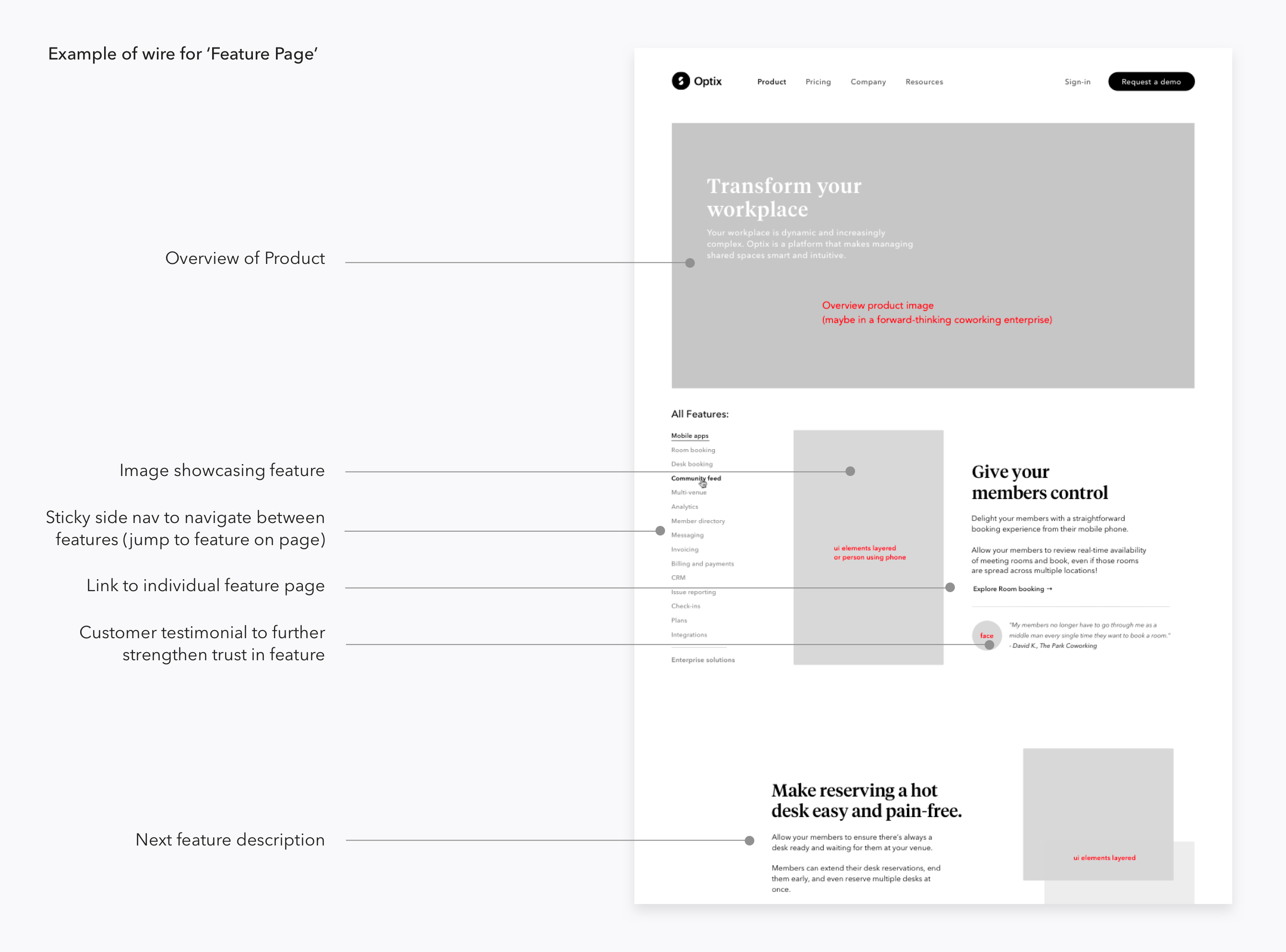
Used Invision to upload wires and create clickable prototypes for iteration. This was a great tool to gather quick feedback and start to get a feel for how the site connects.

System approach
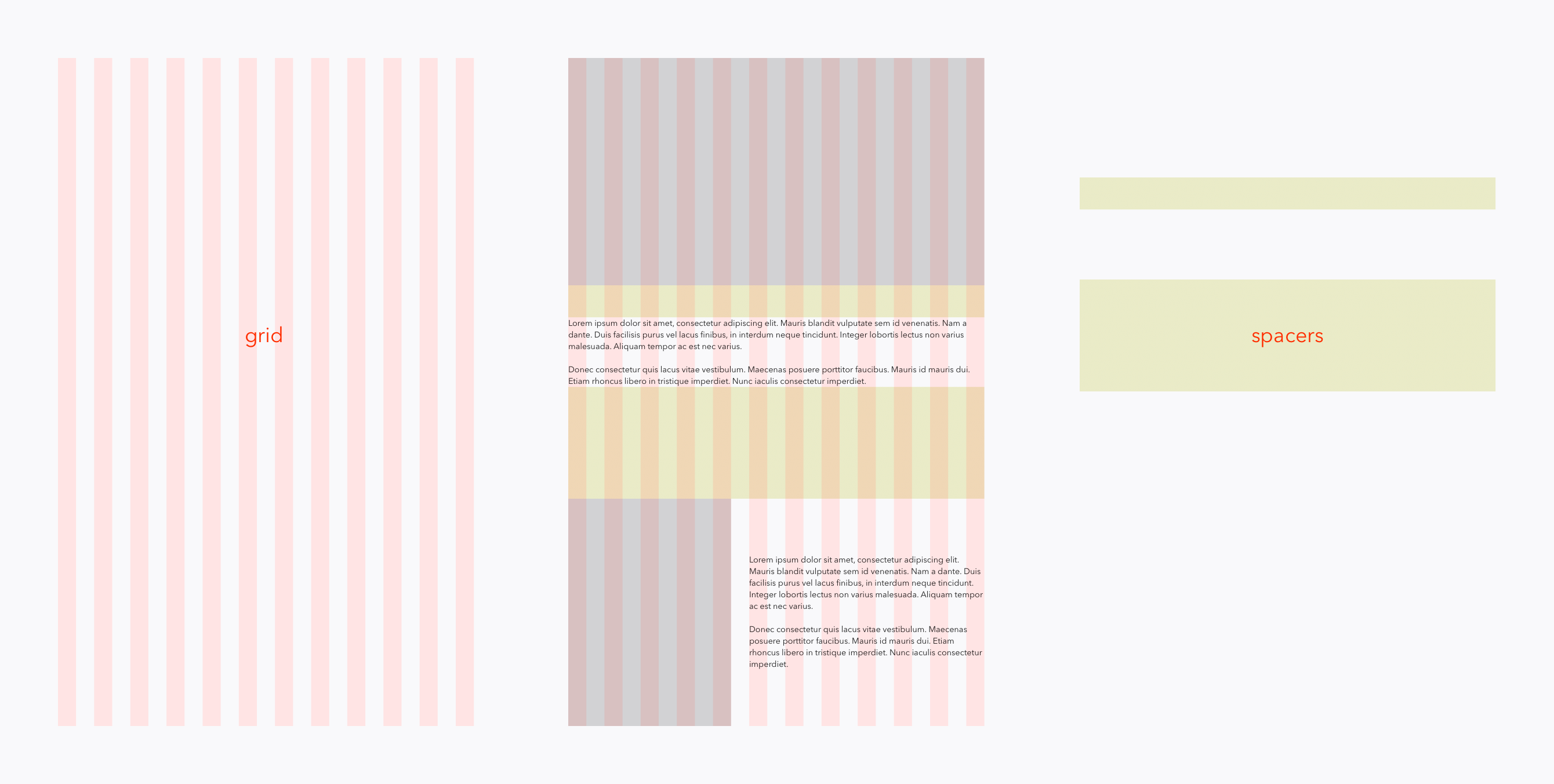
I worked directly with our developers to formulate a system that was easy for them to build and implement. That meant creating a consistent grid for all the pages, consistent image ratios, and a set selection of spacing between sections that could be interchanged throughout the site. Ultimately, I created a system of building blocks that could be added and removed throughout the site.
Key moments
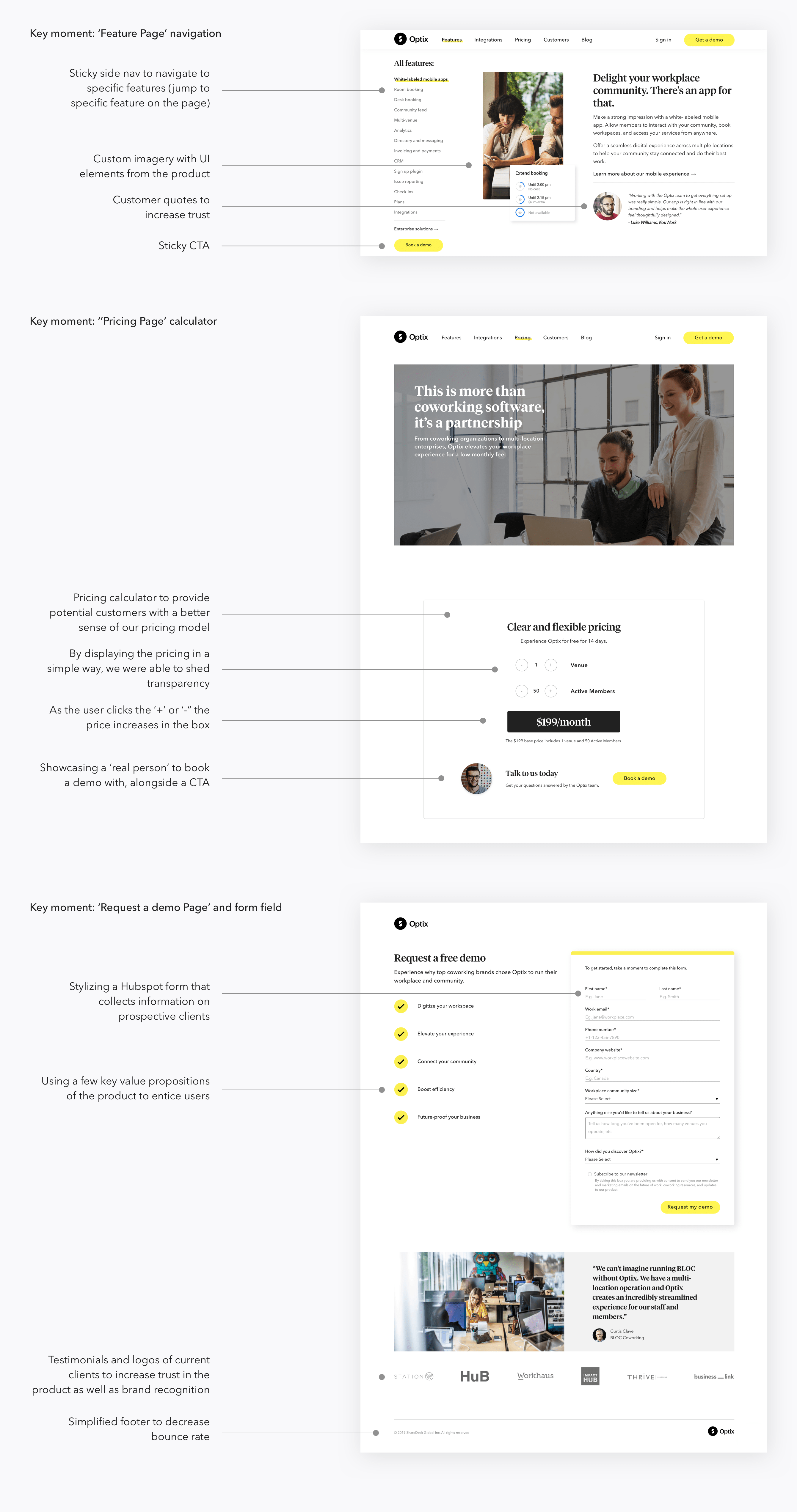
Below are a few key moments from the website that showcase unique user experiences, elements of delight, and areas that I’m truly proud of.
Results
This project resulted in an increase in overall page views, and time spent on the website. As well, an increase of visits to the ‘request a demo page’, and demos booked.
The new brand was also rolled out to the various brand touchpoints and a brand guideline was created by me for the refreshed brand.
The new brand was also rolled out to the various brand touchpoints and a brand guideline was created by me for the refreshed brand.